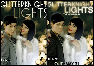
These are the final designs for the Pop Promotional Digipack and Advertisement for the band 'GLITTERKNIGHT' It is developed thoroughly since our first design we made at the start of the project, showing the knowledge we have gained throughout about a good promotional package.
From what we researched about other pop promos we have produced in our digipack and advertisement using the elements to make our package as good as possible. Elements such as the cohesive theme that runs through an artists promotional package. By doing this it begins to present the band more as a brand that just a band. What this achieves is that it makes it more recognizable to people who see the CD or Advertisement, then relating it back to the artists. The more it stays in peoples heads the more likely people are to go home and research about the band inevitably resulting in more sales for the band. The theme we have used for GLITTERKNIGHT is the use of the bokeh (out of focus) style lighting. The same lights that are also used in the music video we have used on the advert and Digipack. Its a feature that stands out thoroughly so using this on all three elements of the package gives it a good edge. It stands out of the background immensely. So it will catch a passers by eyes instantly which is exactly what we want.
We have also kept with the same colour theme. Keeping it simplistic with blacks, whites and creams as the gold lights are the image we have that keeps it standing out. The blacks and whites also give an extra pop, using opposites to give the artists their own identities within the band, also helping stand out on the package. The bands image is positioned specifically to take up most of the CD Cover and Advertisement. This purposely done as they are the main focus that the people want to see. Its all about the artist. Its them we are selling.
The advertisement has the artist name and album name in a bold and bright typeface to keep with the theme of the gold lights in the background. This has to stand out especially on the advertisement as this is what people will look out to find information on the band. And the main information is the bands name and the album name. Below that the release date written in opposite colours to the background it is placed upon keeping it looking bold so its one of the first thing people see after the bands image. Other writing on the poster includes a rating from a prestigious music magazine 'Rolling Stones' To keep the reputation of the band at an impressive level. Also giving the information that the debut single lights is on the album linking the single in so that if people liked that it will encourage them to want to listen to the rest of the album. An important piece of information is the Bands myspace and Twitter. Life revolves around social networking for most people now, so giving that information is vital to produce more fans for the band.
The Digipack for GLITTERKNIGHT is pretty much exact to the advertisement just a more stripped down. Once again this has been to keep the promotional package linking. Using the bokeh lights to keep the linking theme and keeping it standing out when its on the CD racks. The band takes over the whole front cover with the Bands name and album title once again in bold right above. We have just added the CD elements to the bands promotional theme. Mandatory things like the barcode, copyright and the companies logo (universal). The title tracks and the inside 'bands thankyous' are in a glowing typeface to keep the light theme. It's simplistic yet edgy. Stands out enough to catch peoples eyes, but not too much that its painful towards the eyes.
The whole promotional package as a whole i think promotes the band perfectly. Visually and with it's aesthetics. It keeps to the pop promotion idea with the bands own twist incoperated into it, i'm very happy with the outcome


